The historical U.S. inventor collaboration data is almost ready. The matching and disambiguation algorithms have identified more than 1.9 million unique inventors with 4.4 million observations on 3.4 million unique US patents.
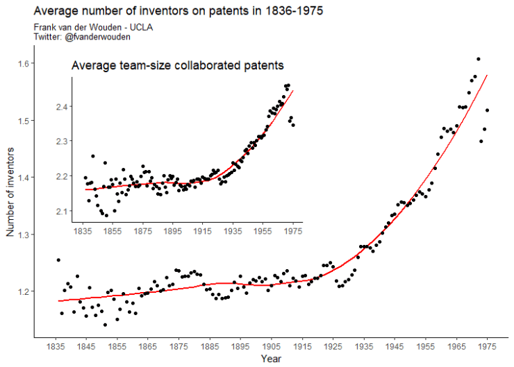
The graph below shows that the average number of inventors on US patents has been growing over time, but that the biggest increase takes place after the 1940s. The average team-size increases from less than 1.3 inventors in 1935 up to 1.6 in the 1970s. This is not merely an effect from a growing percentage of patents being produced as a collaboration, because the same trend is witnessed when only collaborated patents are examined. Up until the 1940s the average team-size is around 2.2 inventors, but increases up to almost 2.5 in the early 1970s.
Inventor collaboration is not spread evenly across space. Inventor collaboration is more common is some cities than in others. Moreover, the average team-size seems to differ across cities too. The graph below shows 140 annual density plots [1836-1975]. Each density plots represent the distribution of U.S. cities based on the average number of inventors on a patent in a city that given year. Overlaying these distributions helps us to see changes over time.

Eyeballing this graph, at least two interesting trends arise. First, the average number of inventors on a patents in cities seems to be increasing over time. This is indicated by greater densities on the right hand side of the graph. Second, the distribution seems to spread out a bit more in later time periods. This suggests there is increasing variation between U.S. cities in terms of inventor collaboration.
Follow me on Twitter at @fvanderwouden
